


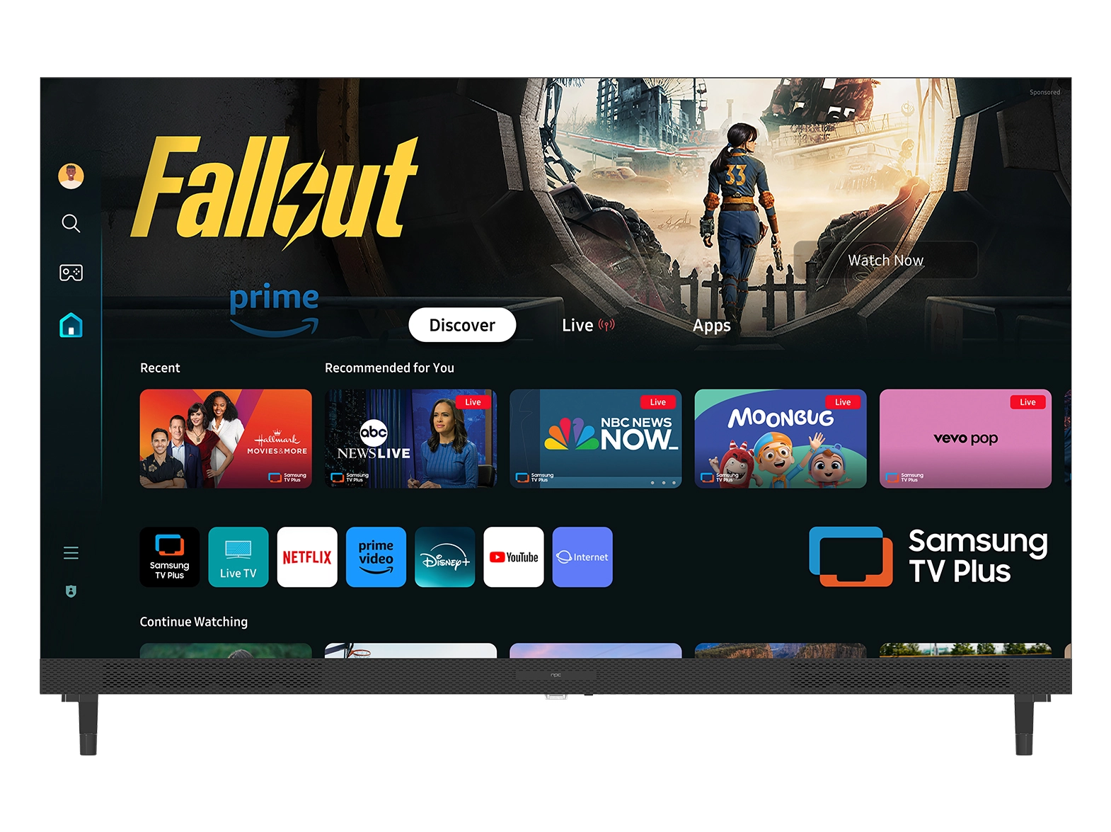


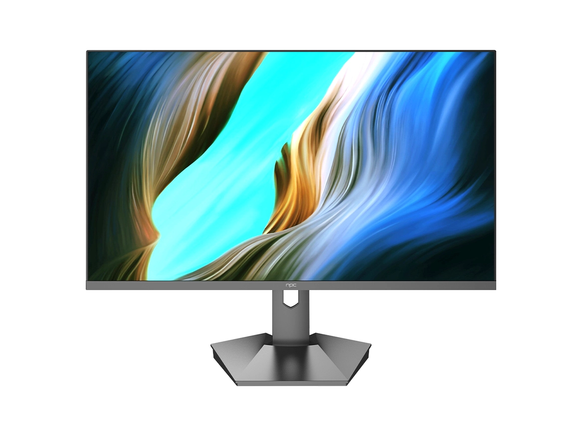


When we develop and test displays at NPC, one of the most noticeable differences users encounter is in typography rendering. Text often appears sharper, smoother, or differently weighted depending on the monitor, resolution, and the underlying technology. We recognize that for professionals working with detailed content—such as designers, editors, and engineers—these differences can significantly affect workflow and visual perception. With our professional pc monitor, we prioritize consistent text clarity and fidelity, ensuring that every character is rendered accurately, which supports precise and productive work environments.

Understanding Typography Differences
Typography rendering can vary widely due to several factors, including pixel density, anti-aliasing methods, and software scaling. On many displays, text may appear jagged or uneven if the monitor's settings are not optimized. At NPC, we invest in research to understand how different rendering techniques affect user experience. Our professional pc monitor series is engineered to deliver uniform text display, reducing eye strain and improving readability during extended use. We also focus on how operating systems interpret font files, ensuring that what users see on the screen matches the intended design without distortion or unintended blurring.
Factors Affecting Professional Text Display
High-resolution panels, refresh rates, and color calibration all influence how text appears on a monitor. We have noticed that even slight inconsistencies in gamma or contrast can change how fonts are perceived. By designing our professional pc monitor with precise calibration and consistent backlighting, we provide a reliable canvas for professionals who rely on text-heavy applications. We emphasize the importance of combining hardware performance with software optimization, so text rendering remains accurate across different platforms and applications. These improvements are particularly valuable for industries where clarity in documentation, coding, or design is critical.
Enhancing User Productivity and Comfort
When typography rendering is optimized, users experience less fatigue and can work more efficiently. Our NPC monitors are specifically built to support professional workflows, offering consistent text clarity across all viewing angles. We understand that businesses and procurement teams require displays that maintain their quality over long hours of use, which is why our professional pc monitor series combines ergonomic design with superior display performance. By focusing on rendering precision, we ensure that professionals can read, edit, and present text with confidence, enhancing overall productivity.
Conclusion
At NPC, we take pride in offering display solutions that meet the exacting standards of professional users. Our professional pc monitor not only delivers exceptional typography rendering but also provides consistent color accuracy, ergonomic comfort, and reliable long-term performance. For distributors, wholesalers, and procurement teams looking to provide high-quality displays to their clients, NPC offers products that combine technical precision with practical usability. By integrating our monitors into professional environments, businesses can ensure that text looks exactly as intended, supporting productivity and operational excellence.


